How To Optimize Your Landing Page to Convert Customers from your Cold Email Campaign

Are you struggling to convert leads into customers through your outbound marketing campaigns, including social media ads, email marketing, google ads, and cold email? If so, you may be making one of the following mistakes on your landing page. This blog post will cover some of the most common mistakes people make when creating landing pages, and we'll provide tips on avoiding them. So read on to learn more about creating an effective landing page that converts!
What is a landing page, and why does your landing page matter?
For those who are relatively new to digital marketing, a landing page is a web page that allows you to collect leads by providing visitors with an offer in exchange for their contact information. A landing page aims to persuade the visitor to take action, such as submitting their contact information, signing up for a free trial, or making a purchase.
Landing pages are a critical piece of any outbound marketing campaign because it's where your visitors will decide to either convert into a lead or customer or bounce from your page. That's why you must take the time to optimize your landing page for conversions as a never-ending process.
So, let's discuss how to optimize using landing page best practices for success when launching outbound campaigns and make sure that your hard work converts into hard cash.
Optimizing A Landing Page for Your Cold Email Marketing Campaign
A Compelling, Benefit-First Provoking Headline
The first thing a customer sees is your headliner or H1. It might just be the most important part of your landing page. Because it's the first thing they will see, it needs to be eye-catching and compelling in order to get them to read further. The goal here is to make the target audience feel emotionally connected and to make them resonate with the message. To do this, we first need to understand what our target audience is feeling, and then craft a message that speaks to those emotions.
It's also important that your headline communicates the benefit of using the product or service that's being offered and is relevant to any simultaneous marketing campaigns. It's also vital that your headline is clear and concise-you don't want to use too many words or be too wordy, as this will turn people off.
Scannability
The average person spends anywhere from five to ten seconds scanning a homepage before deciding whether this is the right fit for their interests. Some media companies even suggest that you have as little as 2.6 seconds to grab someone's attention.
You want to make sure that your landing page is easy to scan and that it has enough white space. People have short attention spans, and you want to make sure that they can easily find what they're looking for on your page. So use clear headlines, subheadings, and images to break up the text and make it easy to read.
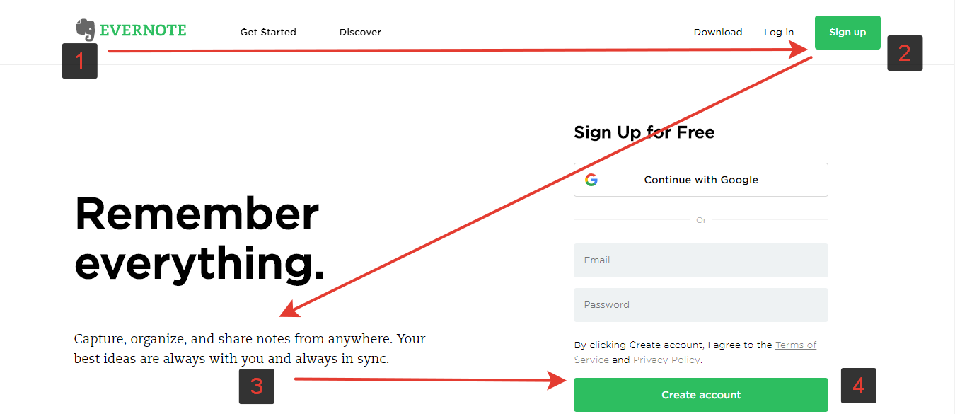
One method here is the Z-pattern for above-the-fold optimization.
The Z-Pattern is the traditional method that the human eye follows when reading: left to right, top to bottom. You will see the Z-Pattern and its use to optimize a landing page in the visuals below. Of course, not all websites must follow this exact pattern, but it is a great tactic to keep in mind when preparing your content.

The Z-Pattern is a great way to optimize a landing page for user experience.
An Intriguing Call-To-Action & Offer
Once you have a great headline, it's important to keep the momentum going with persuasive language and strong calls-to-action (CTAs) throughout the rest of your landing page. Remember, the goal of your landing page is to get the visitor to take action, whether that's subscribing to your email list, signing up for a free trial, or making a purchase. So your CTA needs to be clear and concise-it should tell the visitor exactly what you want them to do and why they should do it.
Powerful Images and Videos
To further persuade your target audience, you'll want to include some emotion-drawing images or videos on your landing page. It's been shown that pages with images or videos are more likely to convert than those without. The key here is to ensure that the images or videos you use are relevant to your offer and message. Relatable, genuine images or videos of real people using your product or service are always a good idea - as if they were using the product or service and gaining the benefit. The images on a landing will make or break the look and feel, so it is important to find the right type of information.
Optimizing Your Forms for Conversions
The end goal of a landing page is to capture your hot prospect's personal information: email, phone number, whatever your business needs to continue marketing and convert them into a paying customer.
When including forms on a landing page, it's necessary to create them in a seamless way for customers to convert. This means making them as short and straightforward as possible or integrating them with Facebook or Google for a quick submission. On the other hand, you don't want to ask for too much information, which might cause a new user to abandon your form. At Growtoro, we stick to the essentials - name, email, phone number-and avoid anything that's not necessary.
Mobile Friendly
You'll also want to make sure that your landing pages offer content and forms that are mobile-friendly. With almost 60% of all internet traffic coming from mobile devices, you can't afford to lose out on potential customers by having a landing page that's not mobile-responsive.
A/B Testing
Once you have your landing page up and running, there is no reason to set and forget. We can't stress enough how critical it is to continuously test different elements on your landing page to see what works best for your target audience. This could be anything from the font or headline to the CTA button color. A/B testing is a process of experimentation where you show two versions of a landing page - version A and version B - to see which performs better in terms of conversion rate. The only way to find out what works best for your particular business is to experiment and test.
Tools To Launch and Test Landing Pages
Now that we've gone over the basics of how to optimize your landing page, let's take a look at some tools to quickly launch successful marketing campaigns.
Optimizely - Optimizely is a tool that allows you to A/B test different elements of your landing page. This is important in order to find what works best for your target audience.
Google Analytics - Google Analytics is a free tool that allows you to track the performance of your website's landing pages. This is important so you can see how much traffic you are receiving and your page's conversion rate. campaign.
Unbounce - Unbounce is one of the most popular landing page builders on the market today. They provide landing pages and pop-ups geared at turning traffic into revenue for your business. Unbounce comes with over 100 templates that you can easily customize in their drag-and-drop editor. All their templates also work with WordPress.
Leadpages - Leadpages offers a variety of tools that can help you create compelling landing pages — including pop-ups, a drag-and-drop page editor with a seemingly endless list of pre-made templates, and more.
HotJar - Hotjar is a tool that allows you to see how people are interacting with your landing pages. By incorporating a "heatmap" you can see where users are hovering, looking, clicking, and more on your landing pages. This is a useful tool so you can make changes to improve the user experience and increase conversions.
Wrapping Up
As you can see, there are a lot of elements that go into creating an effective landing page that converts customers from your cold email campaign. However, by following the tips laid out in this blog post, you'll be well on your way to increasing your conversion rate and driving more business.
Once your landing page is complete, if you would like to launch a cold email campaign at scale using the emails of those who post with relevant hashtags or follow relevant industry and competitor social media accounts, reach out today: growtoro.com


